AMReX Data#
This notebook focuses on handling data in the AMReX format, which is used for both field and particle data. We will cover two main ways to load and analyze this data:
Using the native AMReX particle loader: A faster, more direct way to load and plot particle data without the
ytoverhead. (TODO: Requires testing in 3D geometries.)Using the
yt-based loader: This is the backup method, leveraging the power of theytlibrary for slicing, plotting, and analyzing both field and particle data.
Setup: Imports and Data Downloads#
Imports#
import flekspy
from flekspy.util import download_testfile, unit_one
from flekspy.util.transformations import create_field_transform
from flekspy.util.gmm import generate_synthetic_gmm_data, compare_gmm_results
from flekspy.amrex import AMReXParticle

import numpy as np
import matplotlib.pyplot as plt

# Set display for XArrays
import xarray as xr

xr.set_options(
    display_expand_coords=False,
    display_expand_data=False,
    display_expand_data_vars=False,
)
<xarray.core.options.set_options at 0x7f7203275160>
Downloading Demo Data#
We’ll download two different AMReX datasets to demonstrate various features.
# Dataset 1: General purpose field and particle data
url_1 = "https://raw.githubusercontent.com/henry2004y/batsrus_data/master/3d_particle.tar.gz"
download_testfile(url_1, "data")
Using the Native AMReX Particle Loader#
For scenarios where you only need to load particle data and the overhead of yt is not desired, flekspy provides a direct, experimental loader called AMReXParticle. This is much faster than the yt loader with a simple interface.
data_file = "data/3d_particle_region0_1_t00000002_n00000007_amrex"
pd = AMReXParticle(data_file)
pd
AMReXParticle from data/3d_particle_region0_1_t00000002_n00000007_amrex
Time: 2.066624095642792
Dimensions: 2
Domain Dimensions: [64, 40, 1]
Domain Edges: [-0.016, -0.01] to [0.016, 0.01]
Integer component names: ['particle_id', 'particle_cpu', 'supid']
Real component names: ['x', 'y', 'velocity_x', 'velocity_y', 'velocity_z', 'weight']
Particle data: Not loaded (access .idata or .rdata to load)
Particles within a given region can be extracted by providing the x_range, y_range, and z_range. If any of those is neglected, there is no constraint in that dimension.
x_range = (-0.008, 0.008)
y_range = (-0.005, 0.005)

rdata = pd.select_particles_in_region(x_range=x_range, y_range=y_range)
Phase Plot#
Phase space plotting is achieved via plot_phase:
fig, ax = pd.plot_phase("vy", "vz", bins=(50, 32))
plt.show()
Adding 1D distributions via marginals=True:
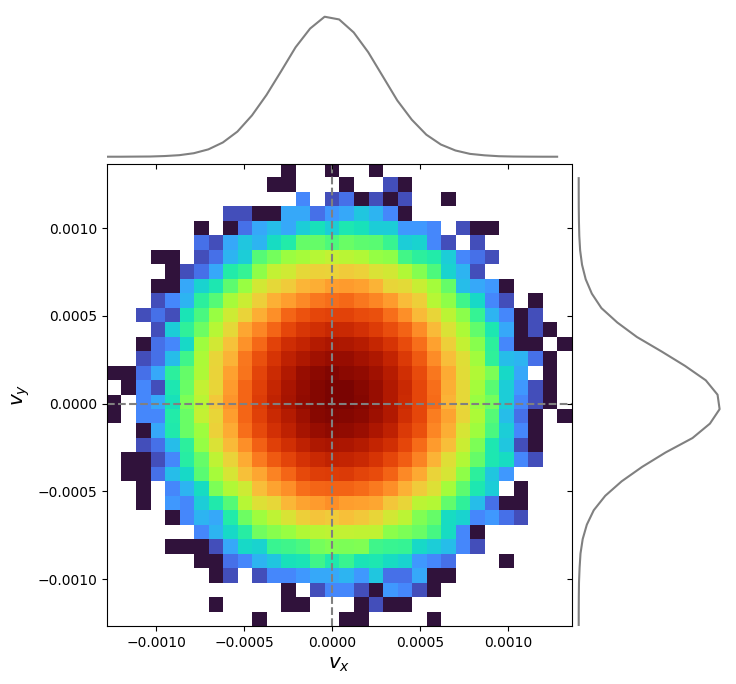
pd.plot_phase("velocity_x", "velocity_y", bins=(32, 32), marginals=True)
plt.show()
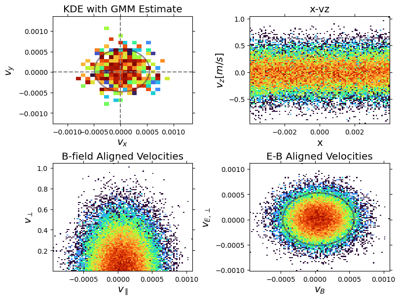
Customization:
# Define the magnetic field vector for the transformation
B = np.array([1.0, 1.0, 0.0])
# Define an electric field vector\n
E = np.array([0.0, 1.0, 0.0])

# Create the transformation function using the utility
# We pass the original component names from the data header
b_field_transform = create_field_transform(B, pd.header.real_component_names)
eb_field_transform = create_field_transform(
    B, pd.header.real_component_names, e_field=E
)

fig, ax = plt.subplots(2, 2, figsize=(8, 6), constrained_layout=True)

pd.plot_phase(
    "vx",
    "vy",
    ax=ax[0, 0],
    add_colorbar=False,
    use_kde=True,
    kde_grid_size=30,
    kde_bandwidth=0.0002,
    title="KDE with GMM Estimate",
)

pd.plot_phase(
    "x",
    "vz",
    ax=ax[0, 1],
    add_colorbar=False,
    x_range=(-0.004, 0.004),
    y_range=(-0.005, 0.005),
    plot_zero_lines=False,
    ylabel=r"$v_z [m/s]$",
    title="x-vz",
)

pd.plot_phase(
    "v_parallel",
    "v_perp",
    ax=ax[1, 0],
    transform=b_field_transform,
    add_colorbar=False,
    plot_zero_lines=False,
    x_range=(-0.004, 0.004),
    y_range=(-0.005, 0.005),
    xlabel=r"$v_{\parallel}$",
    ylabel=r"$v_{\perp}$",
    title="B-field Aligned Velocities",
)

pd.plot_phase(
    "v_B",
    "v_E",
    ax=ax[1, 1],
    transform=eb_field_transform,
    add_colorbar=False,
    plot_zero_lines=False,
    x_range=(-0.004, 0.004),
    y_range=(-0.005, 0.005),
    xlabel=r"$v_B$",
    ylabel=r"$v_{E, \perp}$",
    title="E-B Aligned Velocities",
)
# GMM fit
gmm = pd.fit_gmm(1, "velocity_x", "velocity_y")
pd.plot_gmm_fit(gmm, ax=ax[0, 0], scale=1.0)

gmm2 = pd.fit_gmm(1, "v_B", "v_E", transform=eb_field_transform)
pd.plot_gmm_fit(gmm2, ax=ax[1, 1], scale=1.0)

plt.show()
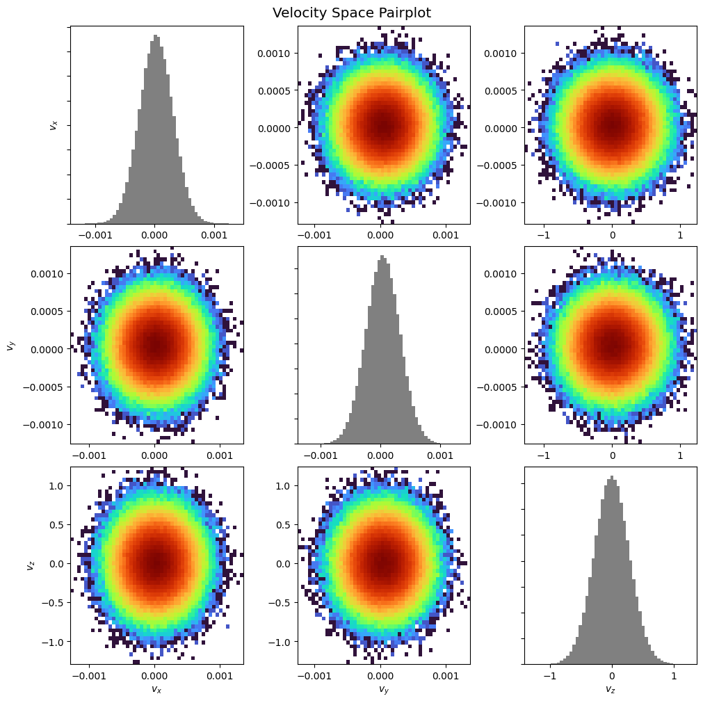
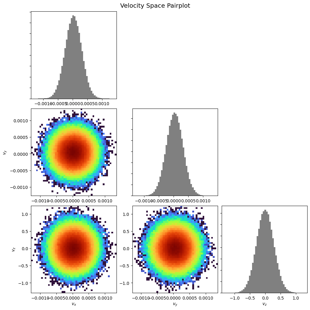
Pairplot:
pd.pairplot()
plt.show()
pd.pairplot(corner=True)
plt.show()
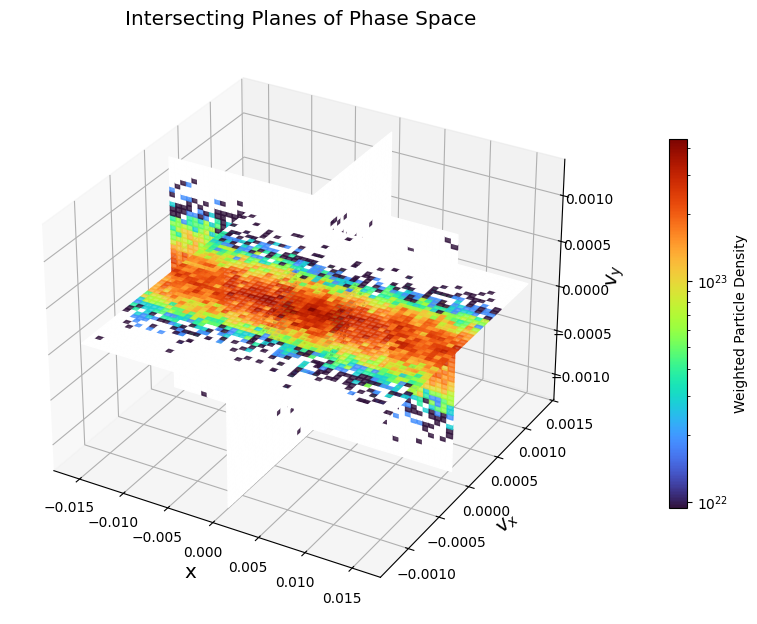
Orthogonal intersecting planes:
pd.plot_intersecting_planes("x", "vx", "vy")
plt.show()
3D scattering:
xmin, xmax, ymin, ymax, zmin, zmax = -0.001, 0.001, -0.001, 0.001, 0.0, 0.01
hist_range = [[xmin, xmax], [ymin, ymax], [zmin, zmax]]
pd.plot_phase_3d("vx", "vy", "vz", normalize=True, hist_range=hist_range)
plt.show()
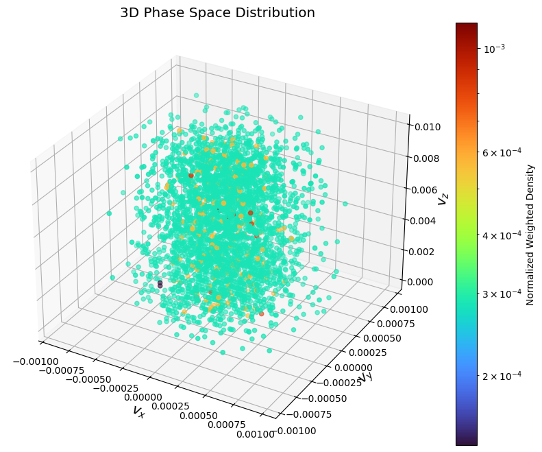
Matplotlib does not have real 3D rendering, which makes it hard for visualizing 3D phase plots.
GMM Fitting#
To demonstrate the capability of the GMM fitting and parameter extraction, we can create a synthetic dataset of particles with known properties, fit a GMM to it, and verify that the extracted parameters match the input parameters.
from scipy.stats import multivariate_normal
from matplotlib.colors import LogNorm
from sklearn.mixture import GaussianMixture
# Define original parameters for comparison
params_isotropic = [
    {"center": np.array([0.0, 0.0]), "temp": 0.5},
    {"center": np.array([1.0, 2.0]), "temp": 0.2},
]

# Define the parameters for two synthetic Maxwellian distributions
components_isotropic = [
    {
        "n_samples": 1500,
        "mean": params_isotropic[0]["center"],
        "cov": np.array(
            [[params_isotropic[0]["temp"], 0], [0, params_isotropic[0]["temp"]]]
        ),
    },
    {
        "n_samples": 1000,
        "mean": params_isotropic[1]["center"],
        "cov": np.array(
            [[params_isotropic[1]["temp"], 0], [0, params_isotropic[1]["temp"]]]
        ),
    },
]

# Generate the synthetic data using the utility function
synthetic_data = generate_synthetic_gmm_data(components_isotropic, random_state=0)

print(f"Shape of the synthetic dataset: {synthetic_data.shape}")
Shape of the synthetic dataset: (2500, 2)
Fit a GMM to the synthetic data with 2 components:
gmm_synthetic = GaussianMixture(n_components=2, random_state=0)
gmm_synthetic.fit(synthetic_data)
GaussianMixture(n_components=2, random_state=0)In a Jupyter environment, please rerun this cell to show the HTML representation or trust the notebook.
On GitHub, the HTML representation is unable to render, please try loading this page with nbviewer.org.
Parameters
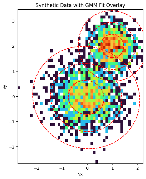
Compare the results. Since the synthetic data was generated with \(m=1\) and \(k_B=1\), the temperature is numerically equal to the variance, so we can compare directly.
compare_gmm_results(params_isotropic, gmm_synthetic, isotropic=True)
--- Original Synthetic Data Parameters ---
  Population 1: Center = [0.0, 0.0], Temperature = 0.5
  Population 2: Center = [1.0, 2.0], Temperature = 0.2

--- GMM Extracted Parameters ---
  Component 1: Center = [1.00069, 2.0008], v_th_sq = 0.21018
  Component 2: Center = [-0.03793, -0.04825], v_th_sq = 0.47898
Finally, we visualize the result. The plot below shows a 2D histogram of the synthetic particle data, with the fitted GMM components overlaid as red dashed ellipses. The ellipses represent the 1, 2, and 3-sigma contours of the Gaussian distributions, clearly showing how the GMM has identified the two distinct populations in the data.
fig, ax = plt.subplots(figsize=(8, 6), constrained_layout=True)

# Plot the 2D histogram of the synthetic data
ax.hist2d(
    synthetic_data[:, 0],
    synthetic_data[:, 1],
    bins=50,
    norm=LogNorm(),
    cmap="turbo",
    density=True,
)
ax.set_title("Synthetic Data with GMM Fit Overlay")
ax.set_xlabel("vx")
ax.set_ylabel("vy")

# Create a meshgrid for contour plotting
x = np.linspace(synthetic_data[:, 0].min(), synthetic_data[:, 0].max(), 100)
y = np.linspace(synthetic_data[:, 1].min(), synthetic_data[:, 1].max(), 100)
X, Y = np.meshgrid(x, y)
pos = np.dstack((X, Y))

# Overlay the GMM contours
for i in range(gmm_synthetic.n_components):
    mean = gmm_synthetic.means_[i]
    cov = gmm_synthetic.covariances_[i]
    rv = multivariate_normal(mean, cov)
    levels = rv.pdf(mean) * np.exp(-0.5 * np.array([1.0, 2.0, 3.0]) ** 2)
    ax.contour(X, Y, rv.pdf(pos), levels=np.sort(levels), colors="red", linestyles="--")

ax.set_aspect("equal", "box")
plt.show()
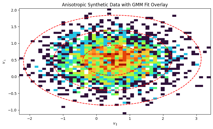
Anisotropic Example#
Now, let’s do the same for an anisotropic distribution, where the temperature is different in different directions. This is common in magnetized plasmas, where temperature is often described in terms of \(T_\parallel\) and \(T_\perp\) with respect to the magnetic field.
# Define original parameters for comparison
params_anisotropic = [
    {
        "center": np.array([0.5, 0.5]),
        "temp_parallel": 0.8,
        "temp_perp": 0.2,
    }
]

# Define parameters for a synthetic anisotropic distribution
components_anisotropic = [
    {
        "n_samples": 2500,
        "mean": params_anisotropic[0]["center"],
        "cov": np.array(
            [
                [params_anisotropic[0]["temp_parallel"], 0],
                [0, params_anisotropic[0]["temp_perp"]],
            ]
        ),
    }
]

# Generate the synthetic data
anisotropic_data = generate_synthetic_gmm_data(
    components_anisotropic, shuffle=False, random_state=42
)
Fit the GMM:
from sklearn.mixture import GaussianMixture

gmm_anisotropic = GaussianMixture(n_components=1, random_state=0)
gmm_anisotropic.fit(anisotropic_data)
GaussianMixture(random_state=0)In a Jupyter environment, please rerun this cell to show the HTML representation or trust the notebook.
On GitHub, the HTML representation is unable to render, please try loading this page with nbviewer.org.
Parameters
compare_gmm_results(params_anisotropic, gmm_anisotropic, isotropic=False)
--- Original Synthetic Data Parameters ---
  Population 1: Center = [0.5, 0.5], Temp Parallel = 0.8, Temp Perp = 0.2

--- GMM Extracted Parameters ---
  Component 1: Center = [0.48075, 0.49185], v_th_sq_parallel = 0.78808, v_th_sq_perp = 0.20246
Plot the 2D histogram of the synthetic anisotropic data:
fig, ax = plt.subplots(figsize=(8, 6), constrained_layout=True)

ax.hist2d(
    anisotropic_data[:, 0],
    anisotropic_data[:, 1],
    bins=50,
    norm=LogNorm(),
    cmap="turbo",
    density=True,
)
ax.set_title("Anisotropic Synthetic Data with GMM Fit Overlay")
ax.set_xlabel(r"$v_{\parallel}$")
ax.set_ylabel(r"$v_{\perp}$")

# Create a meshgrid for contour plotting
x = np.linspace(anisotropic_data[:, 0].min(), anisotropic_data[:, 0].max(), 100)
y = np.linspace(anisotropic_data[:, 1].min(), anisotropic_data[:, 1].max(), 100)
X, Y = np.meshgrid(x, y)
pos = np.dstack((X, Y))

# Overlay the GMM contours
for i in range(gmm_anisotropic.n_components):
    mean = gmm_anisotropic.means_[i]
    cov = gmm_anisotropic.covariances_[i]
    rv = multivariate_normal(mean, cov)
    levels = rv.pdf(mean) * np.exp(-0.5 * np.array([1.0, 2.0, 3.0]) ** 2)
    ax.contour(X, Y, rv.pdf(pos), levels=np.sort(levels), colors="red", linestyles="--")

ax.set_aspect("equal", "box")
plt.show()
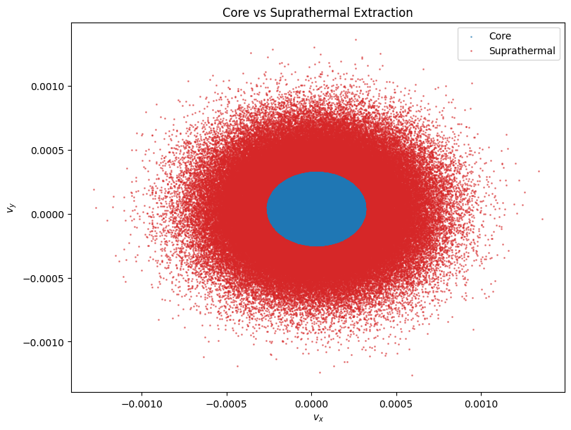
Core Population Extraction#
We can also automatically extract the core population from the suprathermal population. This assumes the core is a Maxwellian distribution centered at the peak phase space density. The method extract_core_population fits a GMM to find the core center and thermal velocity, then applies a cutoff (default 3 * v_th) to separate the populations.
# Extract core population using 2D velocity
core_mask, supra_mask = pd.extract_core_population(
    ["velocity_x", "velocity_y"], v_dim=2, v_th=0.0001, cutoff=3.0
)

print(f"Core particles: {np.sum(core_mask)}")
print(f"Suprathermal particles: {np.sum(supra_mask)}")

# Visualize the separation in 2D (vx vs vy)
fig, ax = plt.subplots(figsize=(8, 6), constrained_layout=True)

# Get raw data for plotting
vx = pd.rdata[:, pd.header.real_component_names.index("velocity_x")]
vy = pd.rdata[:, pd.header.real_component_names.index("velocity_y")]

ax.scatter(vx[core_mask], vy[core_mask], s=1, c="tab:blue", label="Core", alpha=0.5)
ax.scatter(vx[supra_mask], vy[supra_mask], s=1, c="tab:red", label="Suprathermal", alpha=0.5)

ax.set_xlabel(r"$v_x$")
ax.set_ylabel(r"$v_y$")
ax.set_title("Core vs Suprathermal Extraction")
ax.legend()
plt.show()
Core particles: 109619
Suprathermal particles: 146804
Analyzing Field and PIC Particle Data with the yt Loader#
The primary way to load AMReX data is with flekspy.load, which uses yt on the backend. This returns a yt dataset object, giving you access to the full power of the yt analysis framework.
ds = flekspy.load("data/3d*amrex", use_yt_loader=True)
yt : [INFO ] 2026-03-03 20:46:57,871 Parameters: current_time = 2.066624095642792
yt : [INFO ] 2026-03-03 20:46:57,872 Parameters: domain_dimensions = [64 40 1]
yt : [INFO ] 2026-03-03 20:46:57,872 Parameters: domain_left_edge = [-0.016 -0.01 0. ]
yt : [INFO ] 2026-03-03 20:46:57,873 Parameters: domain_right_edge = [0.016 0.01 1. ]
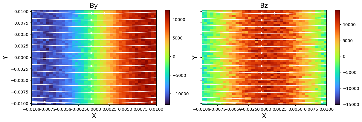
Slicing and Plotting Field Data#
We can easily take a 2D slice of the 3D data.
dc = ds.get_slice("z", 0.5)
dc
<xarray.Dataset> Size: 19MB
Dimensions:              (X: 64, Y: 40, particle_index: 256423)
Coordinates: (4)
Dimensions without coordinates: particle_index
Data variables: (13)
Attributes:
    cut_norm:  z
    cut_loc:   0.5 code_length
    time:      2.066624095642792 code_time
    nstep:     -1
filename: /home/runner/work/flekspy/flekspy/docs/data/3d_particle_region...flekspy provides convenient wrappers for creating plots from these slices. You can use query syntax to plot with value range limits:
f, axes = dc.fleks.plot("Bx>(2.2e5)<(3e5) Ex", pcolor=True, figsize=(12, 6))
dc.fleks.add_stream(axes[0], "Bx", "By", color="w")
dc.fleks.add_contour(axes[1], "Bx")

plt.show()

For more control, you can also extract the data and plot it directly with Matplotlib.
f, axes = plt.subplots(
    1, 2, figsize=(12, 4), constrained_layout=True, sharex=True, sharey=True
)

fields = ["By", "Bz"]
for ivar in range(2):
    v = dc.fleks.evaluate_expression(fields[ivar])
    vmin = v.min().v
    vmax = v.max().v
    ax = axes[ivar]
    ax.set_title(fields[ivar], fontsize=16)
    ax.set_ylabel("Y", fontsize=16)
    ax.set_xlabel("X", fontsize=16)
    c = ax.pcolormesh(dc.X.values, dc.Y.values, np.array(v.T), cmap="turbo")
    cb = f.colorbar(c, ax=ax, pad=0.01)

    ax.set_xlim(np.min(dc.X.values), np.max(dc.X.values))
    ax.set_xlim(np.min(dc.Y.values), np.max(dc.Y.values))
    dc.fleks.add_stream(ax, "Bx", "By", density=0.5, color="w")

plt.show()
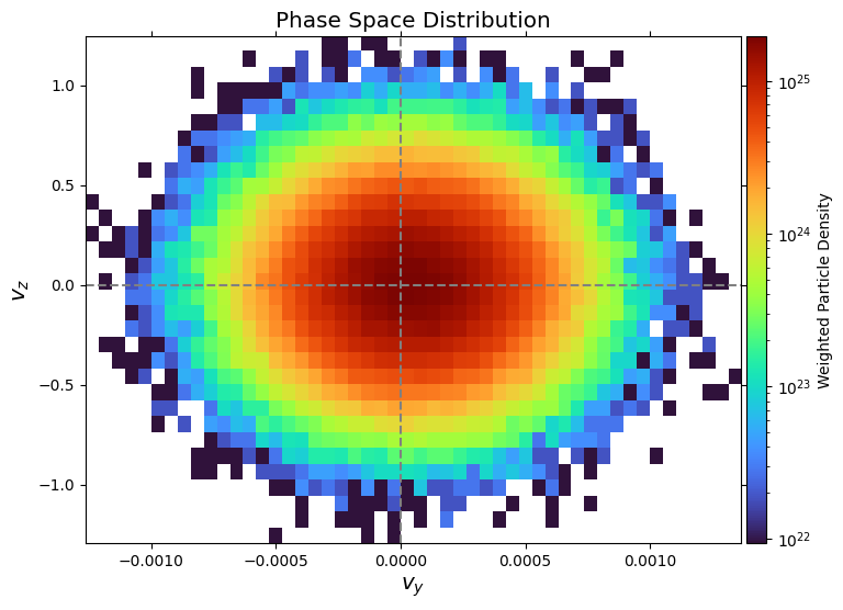
Visualizing Phase Space Distributions#
We can also analyze the particle data. yt allows us to create derived fields, which are useful for weighting particles. Here, we create a unit_one field that simply assigns a value of 1 to each particle.
ds.add_field(
    ds.pvar("unit_one"),
    function=unit_one,
    sampling_type="particle",
    units="dimensionless",
)
Now we can create a phase space plot. We’ll select a spatial region and plot the distribution of y- and z-velocities (p_uy, p_uz), weighted by the particle weight (p_w).
x_field = "p_uy"
y_field = "p_uz"
z_field = "p_w"
xleft = [-0.016, -0.01, 0.0]
xright = [0.016, 0.01, 1.0]

zmin, zmax = 1e-5, 2e-3

region = ds.box(xleft, xright)
pp = ds.plot_phase(
    x_field,
    y_field,
    z_field,
    region=region,
    unit_type="si",
    x_bins=100,
    y_bins=32,
    domain_size=(xleft[0], xright[0], xleft[1], xright[1]),
)

pp.set_cmap(pp.fields[0], "turbo")
pp.set_zlim(pp.fields[0], zmin=zmin, zmax=zmax)
pp.set_xlabel(r"$V_y$")
pp.set_ylabel(r"$V_z$")
pp.set_colorbar_label(pp.fields[0], "weight")
pp.set_log(pp.fields[0], True)
pp.show()

Selecting and Plotting Particles in Geometric Regions#
yt makes it easy to select particles within various geometric shapes.
Sphere#
Plot the spatial location and velocity space of particles within a sphere.
sp = ds.sphere(center=[0, 0, 0], radius=1)

# Plot particle locations
pp_loc = ds.plot_particles(
    "p_x", "p_y", "p_w", region=sp, unit_type="si", x_bins=64, y_bins=64
)
pp_loc.show()

# Plot phase space
pp_phase = ds.plot_phase(
    "p_uy", "p_uz", "p_w", region=sp, unit_type="si", x_bins=64, y_bins=64
)
pp_phase.show()
yt : [INFO ] 2026-03-03 20:46:59,783 xlim = -0.016000 0.016000
yt : [INFO ] 2026-03-03 20:46:59,783 ylim = -0.010000 0.010000
yt : [INFO ] 2026-03-03 20:46:59,785 xlim = -0.016000 0.016000
yt : [INFO ] 2026-03-03 20:46:59,785 ylim = -0.010000 0.010000
yt : [INFO ] 2026-03-03 20:46:59,788 Splatting (('particles', 'p_w')) onto a 800 by 800 mesh using method 'ngp'


Disk#
Plot the spatial location and velocity space of particles within a disk.
disk = ds.disk(center=[0, 0, 0], normal=[0, 0, 1], radius=0.5, height=1.0)

# Plot particle locations
pp_loc = ds.plot_particles(
    "p_x", "p_y", "p_w", region=disk, unit_type="si", x_bins=64, y_bins=64
)
pp_loc.show()

# Plot phase space
pp_phase = ds.plot_phase(
    "p_uy", "p_uz", "p_w", region=disk, unit_type="si", x_bins=64, y_bins=64
)
pp_phase.show()
yt : [INFO ] 2026-03-03 20:47:00,754 xlim = -0.016000 0.016000
yt : [INFO ] 2026-03-03 20:47:00,755 ylim = -0.010000 0.010000
yt : [INFO ] 2026-03-03 20:47:00,757 xlim = -0.016000 0.016000
yt : [INFO ] 2026-03-03 20:47:00,757 ylim = -0.010000 0.010000
yt : [INFO ] 2026-03-03 20:47:00,758 Splatting (('particles', 'p_w')) onto a 800 by 800 mesh using method 'ngp'
Advanced Example: Transforming Velocity Coordinates (WIP)#
This section demonstrates transforming particle velocities into a new coordinate system (e.g., field-aligned coordinates) in yt.
# l = [1, 0, 0]
# m = [0, 1, 0]
# n = [0, 0, 1]

# def _vel_l(field, data):
#     return (l[0] * data[("particles", "p_ux")] + l[1] * data[("particles", "p_uy")] + l[2] * data[("particles", "p_uz")])

# def _vel_m(field, data):
#     return (m[0] * data[("particles", "p_ux")] + m[1] * data[("particles", "p_uy")] + m[2] * data[("particles", "p_uz")])

# ds2.add_field(ds2.pvar("vel_l"), units="code_velocity", function=_vel_l, sampling_type="particle")
# ds2.add_field(ds2.pvar("vel_m"), units="code_velocity", function=_vel_m, sampling_type="particle")

# sp2 = ds2.sphere(center=[0, 0, 0], radius=0.001)

# x_field = ds2.pvar("vel_l")
# y_field = ds2.pvar("vel_m")
# z_field = ds2.pvar("p_w")

# pp = yt.create_profile(data_source=sp2, bin_fields=[x_field, y_field], fields=z_field, n_bins=[64, 64]).plot()
# pp.set_unit(x_field, "km/s")
# pp.set_unit(y_field, "km/s")
# pp.show()