
Colormaps
A colormap is matrix of values between 0 and 1 that define the colors for graphics objects such as surface, image, and patch objects. Colormap is extremely important in conveying messages from raw data.
There are usually three types of colormaps:
- Sequential: one variation of a unique color, used for quantitative data varying from low to high.
- Diverging: variation from one color to another, used to highlight deviation from a median value.
- Qualitative: rapid variation of colors, used mainly for discrete or categorical data.
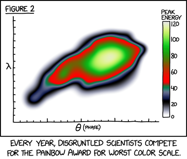
The scientific community has suffered a lot from the traditional colormaps:
-
jet is an example of the rainbow colormap. A rainbow colormap is based on the order of colors in the spectrum of visible light.

It turns out that some people have been writing about problems with rainbow colormaps for years. Here’s a summary of the main criticisms:
- Rainbow colormaps confuse viewers because there is no natural perceptual ordering of the spectral colors. In addition to causing visual confusion (such as whether oscillations are in-phase or out-of-phase), the lack of perceptual ordering can slow down tasks because viewers have to refer to the color key more often in order to interpret the data.
- Rainbow colormaps obscure small details in the data. The primary reason is that the green and especially the cyan sections of the rainbow colormap are perceptually indistinct, which makes the data in the corresponding ranges appear to be uniform or flat.
- Rainbow colormaps mislead viewers by suggesting data features that are not really there. These “phantom features” often take the form of false boundaries. This effect, in combination with perceptually indistinct green or cyan regions, can falsely segment the data.
- Rainbow colormaps lose critical information about high and low data values when displayed or printed on a gray-scale device.
- Rainbow colormaps can be difficult to interpret for some color-impaired viewers.
New colormaps have been proposed to replace the old ones:
-
Viridis, the default colormap in Python Matplotlib for quite a while., is a linear color map that is generally recommended when false color is needed because it is pleasant to the eye and it fixes most issues with Jet.

Viridis has a linear lightness curve.
-
Inferno has the same linear properties of Viridis, but is higher contrast, making it better for picking out detail.

Inferno has a linear lightness curve with a higher slope in a wider range.
-
Parula has replaced jet as the default colormap in MATLAB R2014b.

-
Turbo, is an improved rainbow colormap for visualization.

Turbo has a low-high-low lightness curve. Thus when rendered in grayscale, the coloration will be ambiguous, since some of the lower values will look identical to higher values. Consequently, Turbo is inappropriate for grayscale printing and for people with the rare case of achromatopsia. In principle Turbo can also be used as a diverging colormap. However, there are better options especially using white as the zero background.
The turbo colormap is available since Matplotlib v3.3.1+. To check Matplotlib version, print
matplotlib.__version__. -
Desaturated rainbow. This is the one I found in ParaView which is especially good at showing the details for sequential data.

-
RdBu is the one I prefer in diverging colormaps.

合理地运用色表可以舒缓情绪。正如某位同侪阿昆所言,当你某天看到女朋友的照片,觉得很美,心想:为什么不能把她画到论文插图里去呢?于是,